
Sensitivity on Variable Distributions
The Sensitivity on Variable Distributions tool can be accessed from the  button in the Toolbar, either from a PetroVR Plan project or from a scenario created with the Scenarios tool. It allows you to study how changes in Plan and Econ input variable values using their defined probability distribution impact single results. This sensitivity can be displayed either as a Tornado diagram or as a plot graph.
To run a sensitivity analysis on variable distributions do the following:
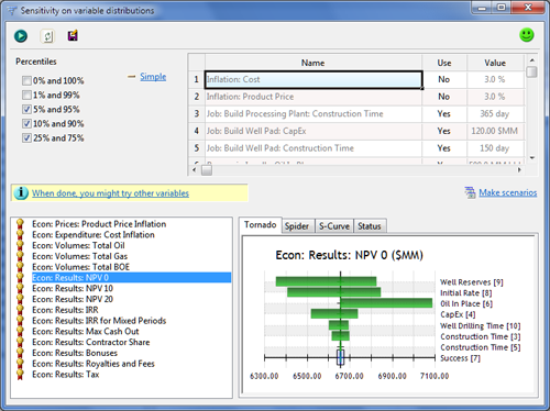
- Include the desired input variables in the sensitivity run by setting their Use cell in the table on the right to Yes. The table only shows those inputs for which a probability distribution has been defined in PetroVR Plan. You can use the button to refresh the list of inputs and results and so make sure to include all changes made after opening the Sensitivity window. Deterministic (not mean) values are used for all input variables not activated in this step.
- Select a percentile in the Percentiles pane on the left. You can click on
 Multiple to select more than one percentile.
 - Click the
 button. This will run one base case without perturbing any variable, and as many cases for each input variable as percentiles have been selected. In the example of the image above, the total number of cases run is nine (1 base case + 4 variables used * 2 percentiles each). Thus, each variable perturbation is calculated independently.
 - Select any of the results in the tree below to graph its sensitivity to changes made to the selected variables. This can be viewed in two forms:
- Tornado: Each bar in this graph represents the value span of the selected result as a consequence of modifying each input variable. Variables whose perturbation had the greatest impact are presented further up in the list. The graph is centered on the base case value, marked by a black vertical line. Selecting a bar in the graph will highlight the corresponding row in the table above, and vice versa.
- Spider: This graph presents the value assumed by the selected result for each variable in each simulation run. You can activate/deactivate variables by clicking on the names below. The result values are displayed on the Y-axis, and the input variable is represented on the X-axis; right-clicking on the graph offers the option to show either variable values or percentiles. When showing values, only one variable can be selected.
- S-Curve: This graph plots sample values against percentiles on a cumulative distribution or S-curve graph, showing the percentage of samples that fall below a given value.
.png)
 in the upper right corner indicates that the sensitivity simulation has not been run since the last time the model was modified, so that the displayed results (if any) are out of date.
  indicates that the sensitivity simulation has been run with the current version of the model, and the results are up to date.
- By right-clicking on the graph panes you can open the graph in a separate window, or copy the graph in image format to the Windows clipboard.
- Use the
 button to save the current results to a .sns file.
  Make scenarios: Use this option to create scenarios from sensitivity iterations. A new Scenarios tool window will open with a separate scenario for each iteration.